In a previous article, I outlined some of the traps in Board papers, including some related to data.
But the subject of how data in Board papers can mislead readers is a rich one, so here are five more traps to look out for.
Averages
Possibly the best known trap, the term “average” can mean many things: mean, mode and median being the least complex.
So what’s the average of these numbers (with no decimals):
1, 4, 4, 4, 10, 20
The mean (add them up and divide by how many there are) is: 7
The median (the half way number) is: 10
The mode (most frequently occurring) is: 4
That’s a heck of a range. And the true meaning can be distorted further if outliers – numbers the author(s) perhaps thought were aberrations and so should not be included – are excluded from the calculation.
So when you see the word ‘average’ being bandied about, particularly if intuition tells you the number looks a little odd, make sure that you know which average is being used, and that the data set is complete.
Dodgy Definitions
Some years ago I advised a household-name security company, that had attracted ferocious press reports for its handling of prisoner escort duties (from prison to court and back again), which it had taken over from the police.
A number of prisoners in their care had escaped, whereas the number of prisoners escaping from police custody was apparently minuscule; evidence, said detractors of the policy, that those duties should remain with the police.
Except when we looked closely at the reported data, we discovered that the definition of ‘escape’ varied between the police and the private sector. The police counted the loss of a prisoner as an escape if they had not been recaptured within 20 minutes. The equivalent for the private sector was 20 seconds. When the escapes were counted on a like-for-like basis, the private sector lost fewer prisoners.
And it was a similar story when it came to the tragic numbers of prisoners who died in police, versus private sector custody; the definitions were different. At the time, some who appeared to have died in a police station were rushed to hospital, and it was there – not the police station – that their death was recorded as having occurred. But if you died in a private sector setting, that was chalked up as a private sector death, irrespective of whether you were taken to hospital or not.
The trap here is obvious – look closely to check that when comparative numbers are being reported, the definitions used (and the real-world behaviours behind them) are the same, especially when dealing with contentious or high-stakes matters.
Charts With Zero Omitted
Glance at the two charts below. I say “glance” because that’s what most people do; charts being designed to impart information, or give a sense of something, very quickly (otherwise a table would be used, which generally demands more work on the part of the reader).
In the first chart it looks as if there’s something like a 60% difference in the height of the two bars. That’s because the bars are not shown in their entirety; the vertical axis is truncated so it doesn’t go all the way down to zero.
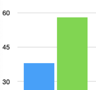
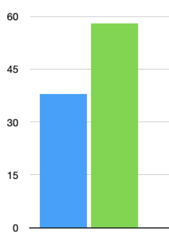
You could argue this saves space; I’d argue that it is simply misleading, because the next diagram shows the chart in its entirety.
As you can see, the difference in height looks about 30% .
I don’t think it’s good enough to say that the vertical scale appears in both diagrams, so the reader can work out what’s intended by the charts.
If you are presented with a report where any graphs shown are either truncated, or interrupted (so a mid section is omitted for space reasons), it could be worth looking at the underlying numbers, to give you a more accurate sense of what’s being reported. And politely insist that truncated charts are not presented in future.
Charts With Missing Axes
Believe it or not, I have seen graphs (in the Board papers of a major, household-name organisation) that were devoid of X and Y axes measurements. The graphs purported to show the impact of brand-building advertising over time, and the line shown was leaping encouragingly skywards.
Except the axes lacked any measurements. The chart was labelled “significant increase in brand awareness” but the X and Y axis didn’t show scales of any nature.
We could have been looking at one axis measured in centuries and the other measured in fractions of a percentage, rather than the quarters and massive improvements in awareness the accompanying narrative described.
The intention was to give an impression rather than detail (the paper was written for non subject matter experts) and not to mislead.
But if I was you, I’d send papers that contained graphs without axes measurements straight back to the author(s).
Optical Illusion
Sometimes data is reported by way of infographic or other graphic device, in order to increase its impact. But there’s a trap here, in that whereas a bar chart or line graph shows relationships readily through the height of the bars or lines, infographics and other visual devices can mislead by confusing height and area.
Look at these charts. They each purport to show the same thing; that one item of data is double the other (2 units and 4 units respectively). The bar chart shows this clearly, but the bubble chart is completely misleading. The bubbles are the same height as the bars, but it’s their areas that catch the eye, and these are ~3 and ~13 respectively.
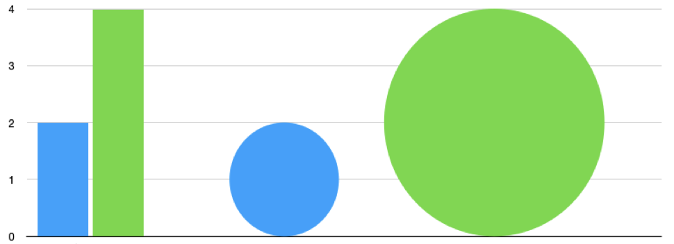
So when you see bubble charts, or infographics, it may be worth asking why a more straightforward measure was not used, and then checking to see whether the author(s) have fallen into the height / area trap.
How to Protect Yourself More Generally
Reading Board and Committee papers to extract their true meaning is a bit of an art.
It’s important to insist that reports are well-written; amongst other things that usually means shorter (unfortunately, few people are taught how to write ‘short’ or indeed how to write for Boards), as longer documents can obscure their meaning through unnecessary complexity, or just fatigue-induced length.
On the other hand, too short and you begin to wonder what’s been omitted – and why.
Common sense and scepticism should be your allies.
If what’s being reported looks too good to be true; if data is shown to three decimal places (creating a spurious sense of accuracy); if there are no outliers or counter-narrative data or opinion present; if you observe some of the visual traps noted above, then it’s time to stop, think and think again.
As always, there’s much to do and time is short, so good luck and get cracking.